Every corporation has a face, captured by its name identity and its image, including the overall image delivery system to push that name in the marketplace. Whether you like it or not, your corporate image is out there and is fully exposed.
Following are the Five Faces of Corporate Image. The question is not which one, rather which is the best suited for you and why. All images are good if they really ring the cash registers, otherwise these masks are sometimes the main reasons for the sinking of marketing strategies and business plans. The five faces are:
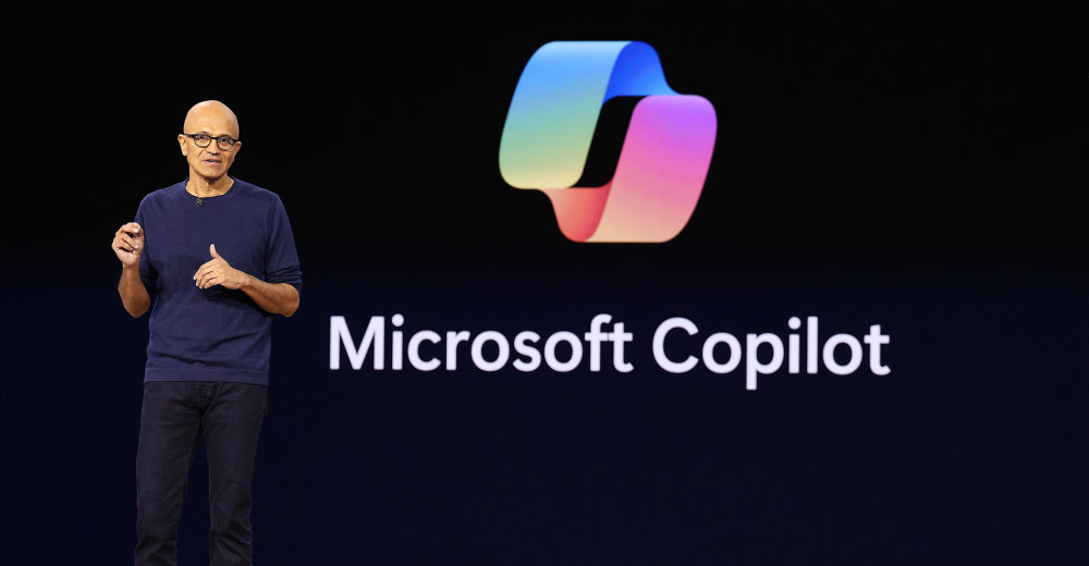
- Hippies. When the image of a corporate identity is simply a spinning burst of soft colors like a freeze frame slice from a kaleidoscope, and you can hear bee bop music from the 1960s, then it’s about time for everyone to ride a painted microbus to a peace rally. It would project that everything is very cool and it moves very slowly, sometimes to a rhythm. This type of image is very common in consumer-packaged goods. Colors are often very pale and very soft. The names are overly slip-n-slide. Today a very large number of companies have adopted this style to appease the consumer.
- Morticians. The image is of dull and dark colors fading to black. Dark suits are a must. Artificial smiles, firm hand shakes and powerful scents. Some distant sound of an organ piped throughout the organization. All would appear to be hypnotized. This kind of image is very common in professional or financial services, although recently banks are dropping this altogether to adopt the earlier image on a fast-track basis. This image has too much rigidity and often is named after the founders, some great landmark or a city or country.
- Ivy Leaguers. Here is some distinct element of intellectual snobbery. Sometimes it really exists, but most of the time it is just a show. In both cases, the image is driven with an elitist language and style, Times Roman fonts and formal lingo. Money and sense of security is the prime thrust. Dark green, dark burgundy and dark blue are the most sought after colors. Famous and literary types of names are used as the corporate monikers. The Internet has made a big punch in style of corporate communications. Now everyone can appear smart and savvy.
- Cybernauts. Here, things are mouse driven, what you see is not what you get. It is here today and gone tomorrow. Ingenuity and stupidity are both displayed in a simultaneous interaction. Just don’t blink too fast. Great ideas, packaged as silly brands and named in the most ridiculous fashion is the standard. Colors are mostly transparent, total imagery and business model is translucent and corporate name identity is transient. As the technology changes, so do the names. There is constant surgery to an existing name, primarily for trademark conflicts, and secondly because the names do not match the business.
- Dinosaurs. Here the long corridors and the stale smell of the office will lead you to the graveyards. Grey and dull color schemes and overuse of florescent lights of the squarely placed HQ speak loud and clear of the glories of the past. The corporate names are several feet long. Some get telescoped or initialized to some weird and strange acronym and initials. Sometimes one can trace the bloody battles of mergers and acquisitions of the past in their lineage as each has left a distinct mark on the corporate name, sometimes a word or others a letter or two.
Then there are also images of no-bodies. Here nothing makes a difference and nothing is so important. What name? What image? What identity? The corporation is like a humongous school project, run by the seat of the pants without a blueprint and chasing opportunities in a panic and in the dark. Welcome to the largest group of companies gathered on the planet. These groups of corporations with images of no-bodies are derived from two main sources: those that have no appreciation for building a proper image and do not care, and those who see this as a direct threat to their other priorities and keep pushing aside their desires to do this professionally one day. Sometimes the day comes and often it never comes.
No matter what, keep an open mind and study the subject. The best way is to measure the cost of your current advertising and branding budgets over the existing name identity and it’s personae. You can bring brand new knowledge into your organization on how to make a brand new makeover. It is very easy, very inexpensive, almost a small percentage of what you are spending now, and once you project your name and image correctly, you will boost your market positioning very fast.
It is a sophisticated system and not to be confused with the traditional branding circus. Makeovers are easy things. Best look in the mirror.
Naseem Javed, author Naming for Power and alsoDomain Wars, is recognized as a world authority on global nameidentities and domain issues. Javed founded ABC Namebank, aconsultancy he established a quarter century ago, and conducts executiveworkshops on image and name identity issues. Contact him at [email protected].


Social Media
See all Social Media