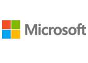
While the upcoming Windows 8 promises big changes to the interface as well as the visual look of Microsoft’s operating system, the company on Thursday opted to introduce another change — to its Windows logo. This one is subtle, yet notable as it has been 25 years since the last change.

The new logo makes such of the Segoe font, which Microsoft indicated was to imply “digital motion,” — reportedly a key to its interface and design philosophy. Although the company has dropped the “Metro” moniker, the look is very much in keeping what has been known until recently as the “Metro” interface.
This introduction comes in advance of the upcoming wave of new products that will include Windows 8, Windows Server 2012, Visual Studio 2012, Windows RT, Windows Phone 8 and Office 2013. Obviously this was not a coincidence.
This is the natural conclusion of where the company needs to be,” said Barbara E. Kahn, professor of marketing at the Wharton School at the University of Pennsylvania. “This signals big changes in Windows.”
New Identity
Microsoft has long been a company that makes software, and most of its bread and butter is in its operating system software. But as the world is changing, with mobile displacing the desktop as how technology is accessed, it could be that Microsoft needs to show that it can change with the times.
Hence the new logo is about that change.
“There are a couple of things going on here, and Windows 8 provides a good opportunity for them to embark on this change,” said Charles King, principal analyst at Pund-IT. “The multicolored squares in the logo emphasizes the diversity of its products beyond the operating system and the office productivity software.”
Microsoft is taking a big risk as it branches out, and as Microsoft noted the logo is about “digital motion,” which signals this move. The name Microsoft even conveys a certain type of brand, King told TechNewsWorld. And as one of technology’s best-known brands, Microsoft is now trying to underline that it aims to make an impact in a new space.
“They have as big a stake in the move to mobile computing as others, they are less known in that space,” added King. “In fact they are less known in mobile than another company that hasn’t changed its logo in 25 years.”
Brand Identity
While the new logo uses the same colors and the same basic “window” look that has been a part of the company for two and a half decades, what is notable is that it conveys more of the same but in a new way.
“The new Microsoft logo is simple, clean, and modern,” said Josh Crandall, principal analyst at NetPop Research. “I wouldn’t say that this is a new logo, but rather a new window dressing on a well-known brand. The addition of color and simple font push Microsoft further into the media world and away from simply technology, which is what the previous logo evoked.”
And this doesn’t appear to be change for change’s sake either.
“It’s smart to upgrade the look in advance of the Windows 8 launch,” added Crandall. “People will take notice and think that Microsoft has something new to offer in their latest release.”
Moreover, changing the logo in advance of big product changes really isn’t that unique. In fact, Microsoft’s use of the same logo for 25 years actually is almost against the norm, especially in the fast-changing world of technology.
“It simply makes sense for a brand to change their logo over time,” Kahn told TechNewsWorld. “In this case it isn’t that big of a change. This is really about freshening it up.”
The changes do appear subtle yet noticeable.
“This is the same colors as before,” added Kahn. “So it is different but not radically different. In the end it makes a lot of sense as they have a new product that could take things in a different direction. They are trying to make a big statement, and they succeeded.”









Social Media
See all Social Media