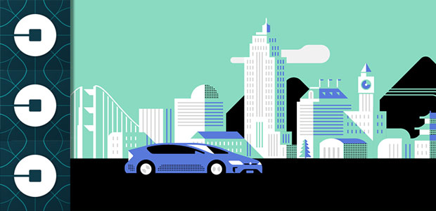
Uber on Tuesday unveiled a new logo, the culmination of a two-year effort to develop a rebranding strategy. The new logo will be depicted in the Uber app in colors localized to each of the 65 countries where the company has a presence.
For example, it’s pink in Mexico, red in India, gold in China and oak in Ireland.
The colors and patterns are meant to bring out Uber’s human side — reflecting how the transportation network is woven into the fabric of cities.
Uber offices in each country will get a toolbox that includes colors and patterns tailored to the country, as well as modern illustrations and guidelines for photography.
The long-term goal is to have unique designs not only for the countries, but also for the cities it operates in, Uber said.
Of Bits and Atoms
In explaining its rebranding, Uber has drawn a comparison between the company’s activities and those of bits and atoms — complex, precise and refined, among other things.
Icons for the Uber rider and driver apps both have a representation of a bit at the center, and the local colors and patterns in the background. This framework will make it easy to develop different icons for new products over time, Uber said.
Uber’s “video introduction tries very hard to touch our hearts in the way that old AT&T commercials once did,” observed Roger Lanctot, an associate director of research at Strategy Analytics. “It would be more touching to talk to Uber drivers about they’re struggling to make ends meet.”
The video “shows random images unmoored to anything identifiable as Uber-like,” Lanctot told the E-Commerce Times. Its pointlessness “speaks volumes” about Uber cofounder and CEO Travis Kalanick’s leadership.
Uber’s logo is “only important or unimportant in that I can either find it on my phone or I can’t,” Lanctot said.
No Love for the Logo
The redesign has drawn many negative comments.
The new #Uber logo is so ugly, and so out of place, I've had to move it off my home page. Hidden the app in the junk folder. #idiots
— Alasdair Allan (@aallan) February 3, 2016
I cannot adequately convey how much I hate the new Uber logo. It looks so ugly on my home screen. #uberlogo #WTF
— thermexperience (@thermexperience) February 3, 2016
why uber would change its logo in peak iconography is beyond me. and yes, it's ugly. and looks like a square sperm entering an egg.
— faith markham (@faithmarkham) February 2, 2016
Poorly Thought Out?
The backlash is real and widespread, “but we have to keep this all in perspective,” commented Larry Chiagouris, professor of marketing at Pace University. The negative reactions will “go away as long as the service delivered remains at a high level.”
Logos are critical for image-driven brands and related products, but Uber is “a utilitarian service which brings no status at all to the user,” he told the E-Commerce Times.
The rebranding “is a great tactic for a well-established company interested in creating news about its business,” but it’s “not a good use of resources at the moment,” Chiagouris pointed out. Uber “would be better off allocating resources to increase the quality and quantity of drivers.”



















Social Media
See all Social Media